The process behind the cover of Domestication - Shannon Knight and Savanna Mayer
27 Jun 2024Savanna: Shannon reached out asking if I would be available to draw the cover for her upcoming book, she mentioned a promise of being able to draw bones and honestly it was a ‘say less’ moment I was all in. For commissions like this, I’ll make a list of what it is the client is specifically looking for in terms of vibes, requirements and elements they’d like to require. I looked over the drawings Shannon had already provided and did my own rendition of them, then pivoted to doing my own spin of what I thought would be the best representation of what Shannon wanted for a cover. Shannon choose a rough sketch and from there I started final linework, checking in with Shannon at each step. Next for color, I did a series of color sketches to provide different palettes, Shannon and I discussed which would work best.
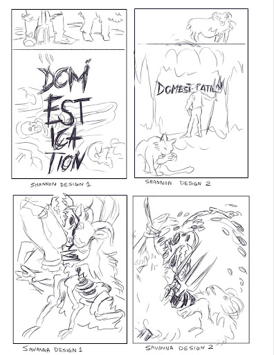
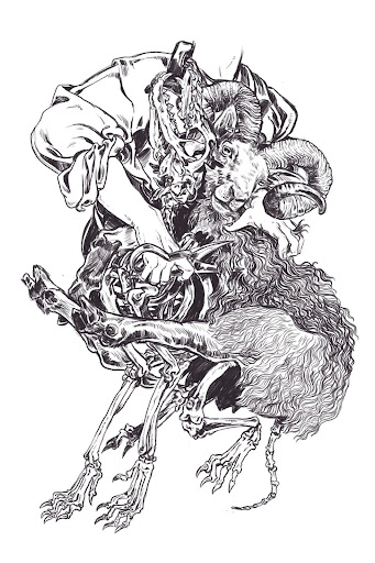
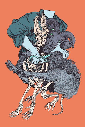
Shannon: I immediately liked Savanna Designs 1, 2, and 4, but I ultimately chose 1 as the design that I felt was both visually arresting and most in line with the story. This is when we drew up and signed the contract. As you can see, Savanna had already put in some work.
Savanna: Shannon chose a rough sketch and from there I started final linework, checking in with Shannon at each step. Next for color I did a series of color sketches to provide different palettes, Shannon and I discussed which would work best.
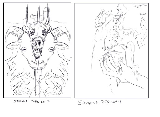
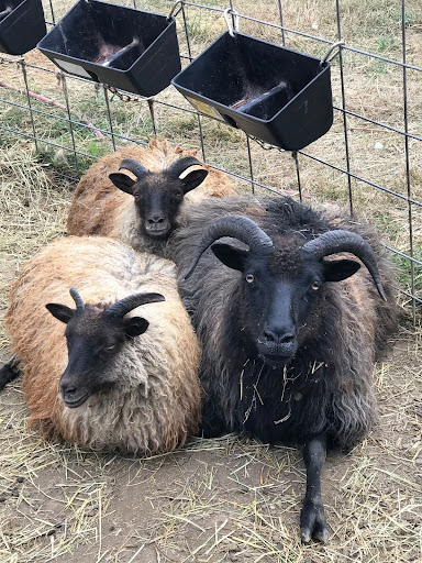
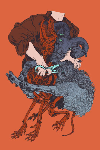
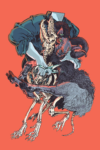
Shannon: I thought 1 and 4 looked supernatural, so I ruled them out. I liked both 2 and 3, but the red on red with the red skeleton really appealed to me, so I asked for that one. I also sent more sheep photos with the heads in this basic position.
Shannon: Next, Savanna completed the line drawing, checking in with me as they progressed.
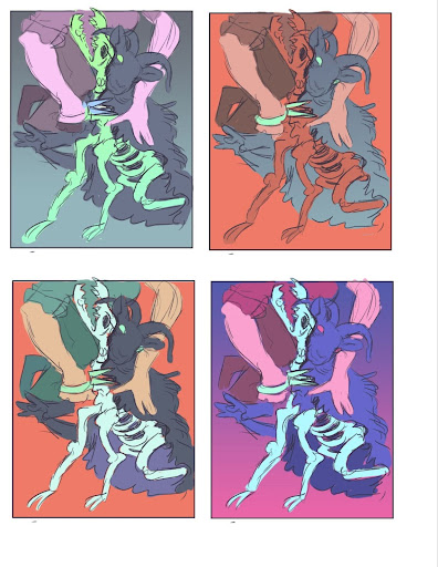
Shannon: Next, Savanna shared the flat colors.
Shannon: This was where we hit our first kink. I’d chosen those colors, but the contrast didn’t work for me. I wanted a skeleton immediately identifiable, even in a thumbnail, and the image didn’t parse smaller. I explained the problem and asked to switch to the third color scheme initially proposed. Savanna said they’d like to try a few options, so we did that.
Savanna: We ended up changing the palette slightly midway through, but the way I work, it’s pretty easy to change a color palette upon request.
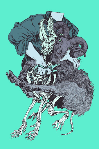
Shannon: From a literary fiction perspective, I like this variety! Savanna and I had both liked the red bones, but when I compared them, especially sized down, it was clear to me that the white would cause more prospective readers to identify bones.
Shannon: I took my time thinking about these options. The blue-green shade was too peaceful. I admit that I was a bit worried the red background had gone too far towards orange. I put both the bottom two (yellow and red with white bones) in Affinity and played around with typography in different colors before choosing the red. Then Savanna did the rest.
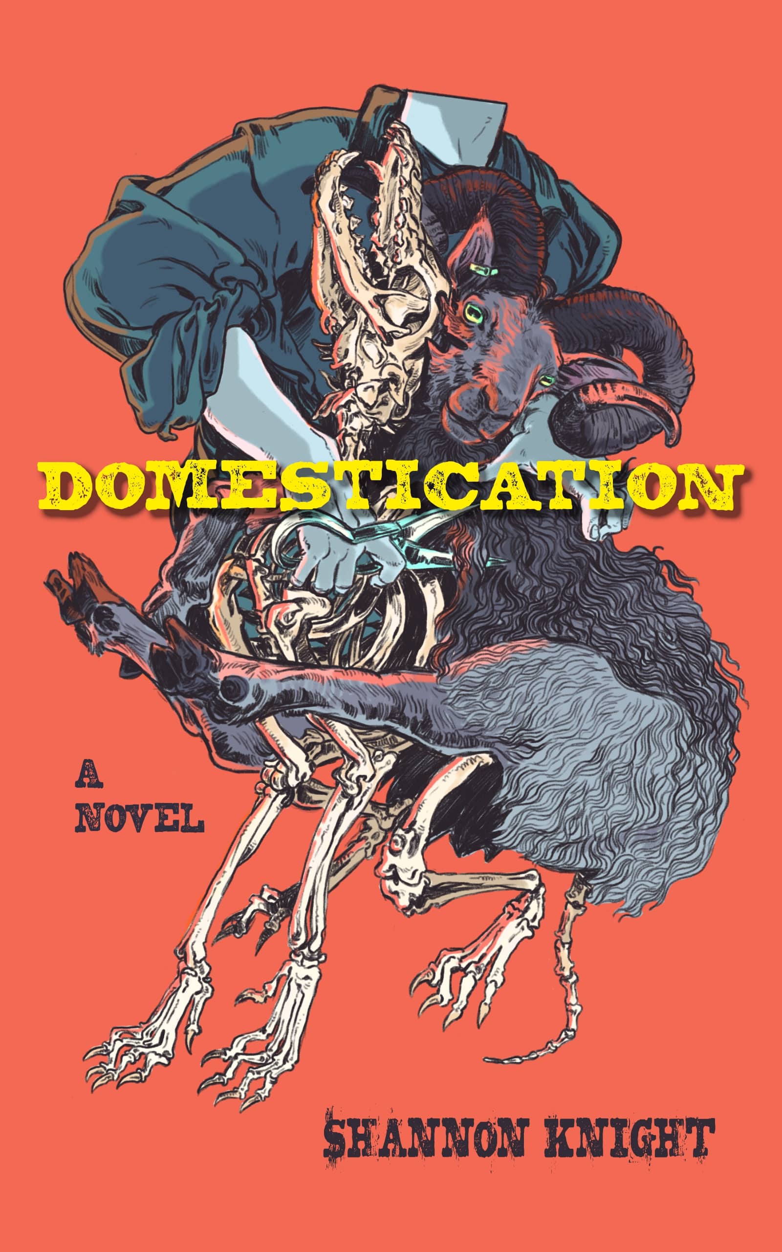
Shannon: As for the final cover, I added the typography and additional elements along the spine, cutting out skeletal portions from the original illustration. I used another font by Eduardo Recife called Magic. (I’d also used a Recife font for my necromancer book, Grave Cold.) I liked both the Western and distressed elements in Magic. The yellow, too, helps bring out the feeling of unease and tension.